Sinch (2024)
Developers getting started with Sinch SMS API
As Sinch adopts a Product-Led Growth (PLG) strategy, optimizing the user experience for developers integrating our SMS API is a priority. To enhance conversion rates, I led our newly established Onboarding Team to streamline the journey for new sign-ups, enabling them to quickly start using the SMS API and convert into paying customers.
Summary
As the UX Design Lead, I led my team to enhance the onboarding experience for Sinch's SMS API. I conducted user tests to identify pain points, and with an agile approach, we made significant improvements. We streamlined the process by making API parameters easier to locate, enhancing documentation, and adding better error handling. These changes reduced the time to the "Aha-moment," resulting in a smoother and more reliable experience. As a result, user satisfaction and conversion rates increased. This is an ongoing project.
Part I: What is the current onboarding experience like?
After sign up, users needed to find the option "SMS" and "Getting Started" in the menu. In this page users could send test messages, explore links to documentation and learn about a few benefits about upgrading.
Previous design of the Getting started page before improvements
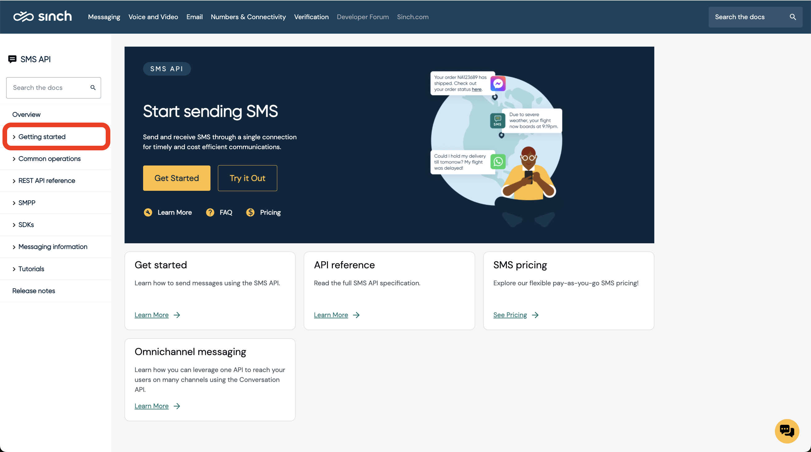
Another crucial resource when using the SMS API is the documentation. It offers step-by-step guidance and detailed explanations to ensure a smooth integration process. The "Getting Started" section is specifically tailored for new users, with guides and SDKs available in multiple programming languages, allowing users to find resources in their preferred language.

Getting started section in SMS API Documentation
Sending a test SMS
I began by examining the current experience. I conducted user tests with 10 backend and full-stack developers of varying experience levels. These developers were tasked with using our SMS API to build a small application and send a test SMS to themselves using their code editor. By doing this, we could examine the entire journey and identify potential problems firsthand. This method allowed us to:
- Observing developers in a natural setting: using their own code editors provided insights into how our API is utilized in real-world scenarios.
- Directly witnessing the challenges and frustrations developers faced helped us pinpoint specific areas that needed improvement.
- Developers provided immediate, candid feedback about their experience, enabling us to understand their perspectives and needs better.
- Assess how effectively our documentation and support resources assisted developers in overcoming obstacles.
The user test covered these phases of product experience:
The main phases when testing Sinch SMS API
Key research insights
We found that only 3 out of the 10 participants successfully sent an SMS to themselves, which was below our expectations. Our goal was to achieve a 100% success rate, with each participant completing the process within 5 minutes. To understand the reasons behind this outcome, we examined the entire user journey of each participant.
I conducted a detailed analysis of the tests, measuring the time each participant spent on the tasks.
From the analysis, the pain points detected during the process were; Difficult to find the right section in documentation, difficult to find the parameters in the platform and lack of error handling.
Difficult to find the right section in documentation
Some participants struggled to find the correct section for their preferred language in our documentation, with two spending 16 and 25 minutes respectively. This difficulty was primarily due to broken and confusing links on the platform, making it challenging for them to navigate to the appropriate section. However, once they found the right section in the documentation, it only took them a couple of minutes to understand what they needed to do.
Difficult to find the parameters in the platform
To use the Sinch SMS API, participants needed to navigate the platform to locate three parameters: 1) their API token, 2) Service Plan ID, and 3) the Sinch test number provided for the trial. Most participants used links from the documentation to find them. However, they encountered several challenges in the process and still struggled to navigate the platform to find these three parameters. It took, on average, 6-8 minutes for the participants to locate them.
Lack of error handling
Due to fraud attacks on our platform, some regions are temporarily restricted from sending SMS. Unfortunately, this means users in these regions aren't able to try the SMS API either. During the user test, UK numbers were blocked. Participants simply didn't receive an SMS and they were not informed about it. This created uncertainty about their verified phone numbers, leading some to think they had entered the wrong number upon registration. As a result, participants thought they made a mistake and therefore tried to change the number which the SMS should be sent to, which led to another error. The API responded with "Messages can only be sent to your verified number in test mode." Users didn't understand what "in test mode" meant.
The lack of clear communication and transparency breaks trust. Participants felt uncertain and frustrated, doubting the reliability of the platform. They questioned whether their actions were correct and whether the service was dependable. The eroded confidence in the API and the platform as a whole makes them less likely to trust and use the service in the future.

An improved suggestion would be: "In test mode, the SMS API only sends messages to verified phone numbers. This ensures security. Verify your number in the Sinch Customer Dashboard."
Part II: How might we ensure all participants are successful in sending a test SMS within 5 minutes?
To reiterate, ensuring all participants can build an app and send a test SMS within 5 minutes is vital. It shows the Sinch SMS API is easy and reliable, creating a strong first impression. Developers have low motivation at the start and need quick proof that it works. If it fails, they will quickly abandon it. A smooth first experience builds trust, leading to more conversions.
Illustration showing where developers drop off in the onboarding funnel
Benchmarking & setting goals
I conducted a competitor analysis to compare our onboarding experience with that of our main competitors. The goal was to understand how our experience measures up, recognizing that developers often evaluate multiple providers before making a decision. This involved benchmarking their onboarding processes against ours, focusing on key aspects:
- How users were guided through the first encounter with the SMS API
- How important concepts like test numbers were explained
- The clarity and accessibility of documentation
- The availability and quality of tutorial videos or interactive guides
- The effectiveness of the UI
By examining how competitors structured their onboarding journeys, what support materials they provided, and how they guided new users, we gained valuable insights into industry best practices.
I mapped the onboarding journeys of all major competitors. Here is one example.
The comparative analysis highlighted our strengths and pinpointed areas where we lagged behind. It helped identify specific improvements we could make to streamline our process, reduce friction, and enhance the overall user experience. Leveraging these insights allowed us to align our onboarding process more closely with industry standards and best practices, ultimately making it more competitive and appealing to developers.
Comparison of competitors
Fueled by insights from competitor analysis and the user tests, we set clear goals to address the biggest challenges in our onboarding process. Our primary objective was to remove roadblocks and ensure a smooth, competitive experience for developers We systematically tackled these issues by working in fast iterations. Focusing on eliminating friction and optimizing the onboarding funnel, and optimize the onboarding funnel for a smoother and more developer-friendly experience.
Goal 1: Reduce API Errors & help users solve them if they occur
To keep the API stable and reliable, we regularly checked logs and listened to user feedback to fix problems. I users weren't able to send SMS we made sure to inform users. This helped maintain trust by keeping users aware of any issues affecting message delivery.
Analytics & help users solve errors
Users lacked sufficient information about issues, so we added a link to our analytics tool, Message Search, when the API request was sent. Message Search provides detailed SMS logs, including error code descriptions, timestamps, delivery status, and fees. This allows users to understand and resolve issues related to the API request and increases the discoverability of Message Search. Long term, we plan to display this data directly in the UI on this page, but that is a later milestone.
Additionally, we added the API response directly in the UI because we noticed some participants were using the browser console to view it. This change ensures users can easily access important information without resorting to technical workarounds.
Goal 2: Reduce time to find parameters
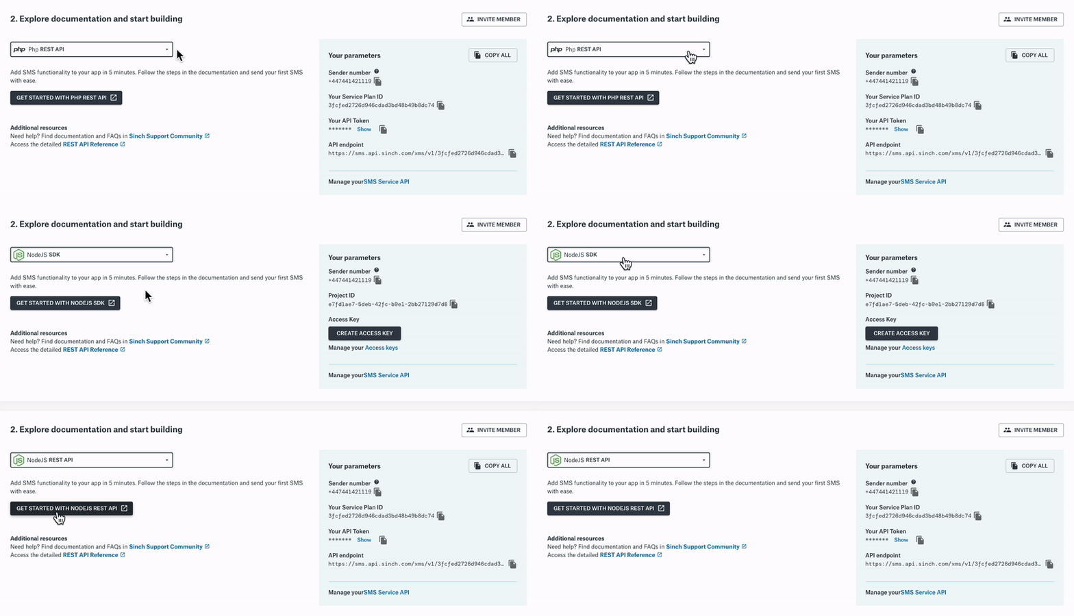
Users were spending too much time searching for parameters, hindering the overall efficiency of their journey. They needed to navigate through multiple sections to retrieve them, often getting lost in the process. To address this, we aimed to keep them on the same page by consolidating all necessary parameters in one location.
Goal 3: Shorten time to find right section in documentation
To reduce the risk of having users struggle to find the right section in the documentation, we reviewed all critical links in the documentation and platform to ensure they functioned properly. We collaborated closely with the documentation team, suggesting improvements to help users find the right sections more quickly.
We also introduced a dropdown with all SDKs and Rest API guides available. This was to help users faster find the most suitable section in the documentation.

Users can now select their preferred language to access documentation
Goal 4: Prevent errors
Users testing the SMS API can only send messages to phone numbers verified on their account to prevent fraud and ensure platform security. Previously, the input field allowed users to type in numbers, causing errors when unverified numbers were entered. To reduce these errors and improve user experience, we replaced the input field with a dropdown menu of verified numbers.
We also added the functionality to verify a new number directly on this page, eliminating the need for users to navigate to another page which was the case before.
Result
The goal of this project was to optimize the onboarding journey for new developers testing the SMS API using an agile approach. We identified numerous user pain points and tracked the time it took for users to try the SMS API, aiming to reduce this time to under 5 minutes. My team and I enhanced the UI of the SMS Getting Started page and collaborated with other teams to improve the backend, API functionality, documentation, and test number provisioning.
Our goal was to streamline the SMS API onboarding, reducing completion time to under 5 minutes
This ongoing project will be evaluated by usability tests in August 2024. However, we have already observed a surge in conversion rates and other metrics such as increased user satisfaction, reduced onboarding time, and higher engagement levels.
Looking ahead, we will continue optimizing the SMS onboarding journey. Our focus will expand to cover more steps of the product adoption journey, including introducing messaging logs and providing better guidance on selecting phone numbers for sending live messages.
New design of the SMS Getting started page after the improvements
About Sinch
Sinch provides communication APIs and applications for smooth interaction between companies and their customers. Their solutions cover diverse communication channels including SMS, voice, video, and social media platforms. This enables businesses to effectively engage with their audience across multiple platforms and devices, ensuring enhanced connectivity and customer satisfaction. Learn more about Sinch.